Launching a new product to fuel Displate’s strategic shift
Product Design, Product Management, Strategy, Product Research

In the post-COVID landscape, businesses face dynamic shifts in customer behavior and market conditions. Customer Acquisition Costs (CAC) are rising, making it critical for companies to not only retain existing customers through strong engagement but also optimize marketing spend to attract new ones. Displate sought to launch Textra, a new product designed to differentiate the brand in a competitive market. The goal was to reduce CAC, strengthen customer retention, and anchor the pricing of Displate’s standard offerings. Displate is in a strategic transition - from a leader in metal posters to a recognized brand for collectibles. This shift is gradual, and Textra, along with a revamped Product Page, is a key enabler.
In the post-COVID landscape, businesses face dynamic shifts in customer behavior and market conditions. Customer Acquisition Costs (CAC) are rising, making it critical for companies to not only retain existing customers through strong engagement but also optimize marketing spend to attract new ones. Displate sought to launch Textra, a new product designed to differentiate the brand in a competitive market. The goal was to reduce CAC, strengthen customer retention, and anchor the pricing of Displate’s standard offerings. Displate is in a strategic transition - from a leader in metal posters to a recognized brand for collectibles. This shift is gradual, and Textra, along with a revamped Product Page, is a key enabler.
My role
As a Head of Digital Product Design, I:
Outcome


Product presentation at scale
Displate hosts over 1.5 million artworks, creating complexity in consistently presenting Textra’s unique characteristics (3D texture and selective varnish). The Product Page - the most frequently visited entry point for new users - had to convey Textra’s value proposition effectively, ensuring first impressions convert into lasting engagement.
Cross-department collaboration
The product page intersects multiple teams, including marketing, engineering, product, and analytics. Aligning priorities, workflows, and expectations posed significant challenges.
Experimental product
Committing to full-scale development and launch without validated customer demand would have been a high-risk, one-way door decision.
Outdated UI
The UI hadn’t been updated in years and already appeared outdated, clashing with the message Displate aimed to convey — a modern product for modern customers. Creating a fresh, contemporary interface while working with a limited color palette and typography presented its own challenges. At the same time, we had to ensure it remained consistent with the rest of the site and didn’t feel out of place.
Extensive historical data on customer behavior and product page performance indicated the page’s critical role in both customer acquisition and performance marketing. Catalog ads - a major marketing expense - direct customers to the Product Page, making optimization essential, but risky. Given the strategic importance of Textra, I initiated a phased approach combining meticulous planning, cross-functional alignment, and iterative design & testing.
Before diving into execution, I focused on securing buy-in across departments. This involved:
Before initiating the redesign of the product page, we conducted extensive user interviews, surveys, usability studies, and analyzed behavioral and performance data.
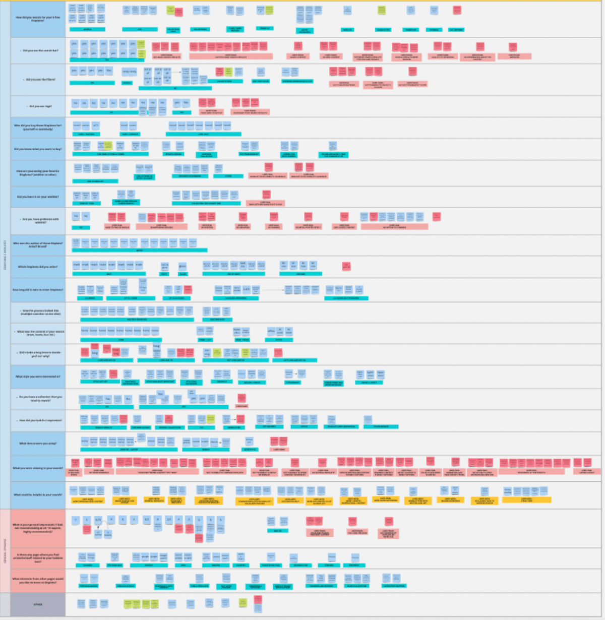
The key findings are summarized below:

Building on our insights, we asked ourselves a few fundamental questions:
These questions shaped the vision for the new product page: an immersive, intuitive, and scalable experience that would support both our current and future product lines. Based on this vision and insights, we defined clear experience goals:
While working on organizational alignment, we began exploring new ways to present products - especially considering the launch of Textra, our new scalable product line. One key question arose: would it be feasible to record every Textra product as a video, similar to how we showcased our limited editions? Given the scale, this was unlikely to be efficient. Another exploration involved a concept utilizing 3D models to create a dynamic, interactive product experience.
However, a critical question remained: will customers actually like this new experience? We had many creative ideas, but with tight timelines and limited resources, we had to quickly prioritize where to invest our time and budget.
The primary challenge was communicating Textra’s 3D value proposition effectively to customers. Given the vast Displate catalog, traditional product presentation methods like dedicated photoshoots or video recordings were not scalable. I championed a WebGL-based product visualization to enable an interactive 3D experience. However, WebGL posed risks - internal expertise was limited, and potential performance trade-offs could impact page speed and conversion.
To mitigate these risks, I proposed an iterative validation strategy:
This approach allowed us to validate assumptions and de-risk technology adoption before committing development resources, which was crucial - resources were stretched due to high-season priorities (November and December sales).
We designed over 10 iterations of the Textra experience, with a particular focus on:
The final experience emphasized product visualization, intuitive navigation, and performance efficiency.
One of the most challenging aspects of the project was designing the product customization. In the early prototypes, we explored multiple approaches, aiming to balance flexibility with clarity. After a series of user testing sessions we implemented the most straightforward version, focusing on ease of use and speed of decision-making.

Rather than a high-risk full-scale launch, we executed a phased rollout:


This project not only delivered strong business outcomes but also set new standards for how product and design can drive strategic impact within an organization.
Cross-functional collaboration
Success hinged on early stakeholder alignment, transparent communication, and shared goals across departments
Risk mitigation through advanced prototyping
The Webflow prototype was pivotal in de-risking development, allowing us to validate user interest and technical feasibility 2 months in advance, before committing resources
Design as a strategic driver
Beyond metrics, Textra became a case study within Displate for design-led thinking, fostering a culture that values user research, iterative design, and cross-functional synergy
Scalable process
The methodologies and processes refined during Textra’s development have since influenced other product initiatives within the company.